At the beginning of the year, I started using an application on my phone that I believe I can call a startup product. The process of introducing new features, collecting user feedback, and providing support was so well done that it caught my interest. When I found out that this app was developed by only four people, I was impressed. That inspired me to write this article. Today, I want to explore the entire product development process: What part of it involves coding? How do you deliver meaningful value to customers with limited resources? And what can we learn from this case to improve our programming skills? Let’s find out!
Disclaimer
For this article, I’ll use the Indyx mobile app as an example. Since I’m using the iPhone app, I’ll be sharing my experiences specifically on that platform. I know that Android users have reported certain issues, especially with the no-code app released before November 2023, including challenges with signing up and slower item uploads. My experience on iPhone has been different, with speed being the only issue, which has since been improved. So, while this article reflects my personal experience, it may not capture every user’s journey. This article is not sponsored by Indyx; however, I was really impressed with their approach and I hope this provides valuable insights into the development and design process.
Basic Information
Before we dive into the product development process, let me give you some background on the project and the people behind it.
What is the app’s domain? What is it for?
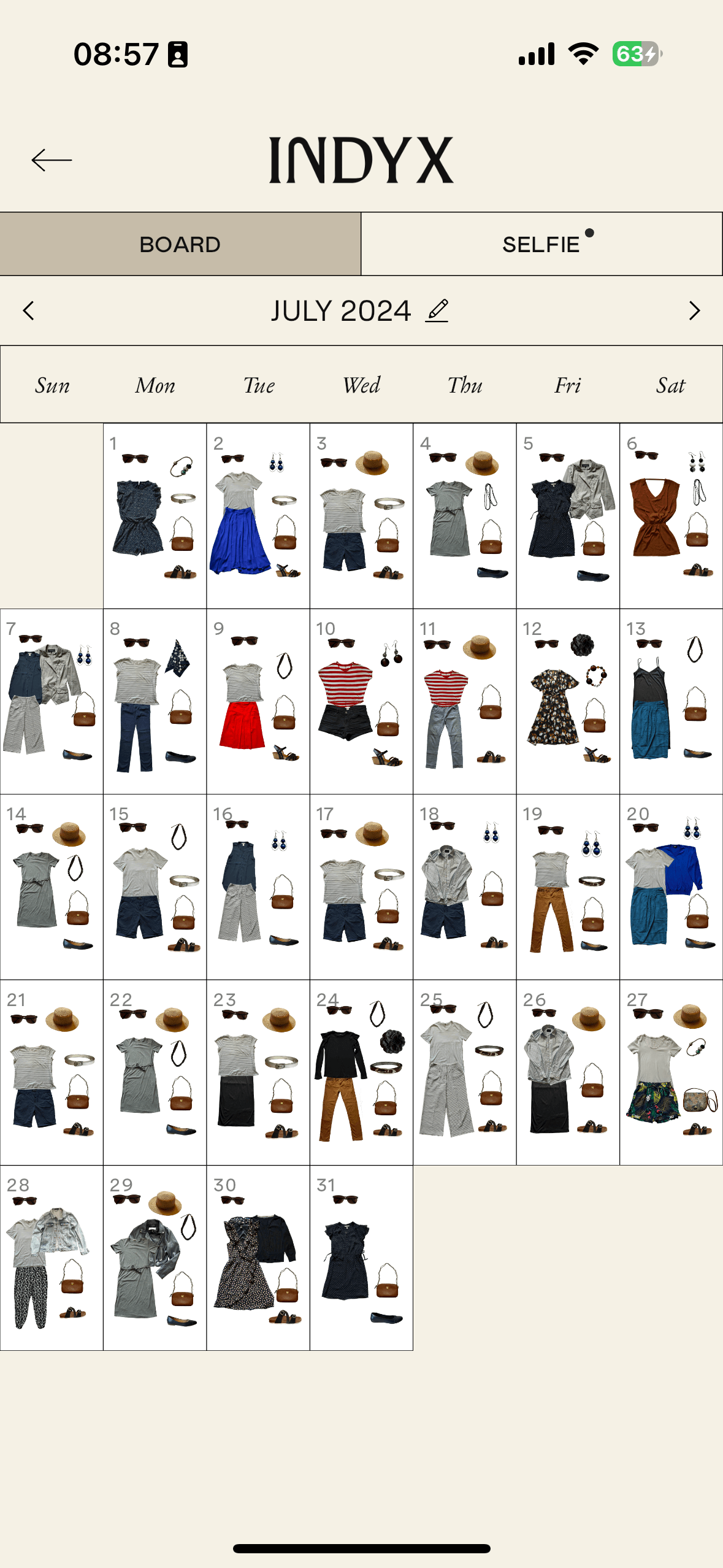
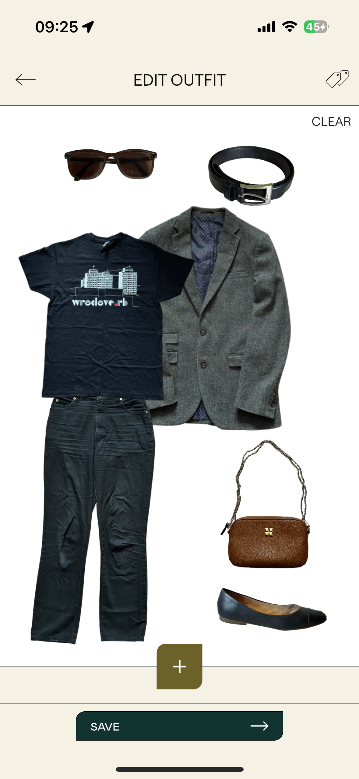
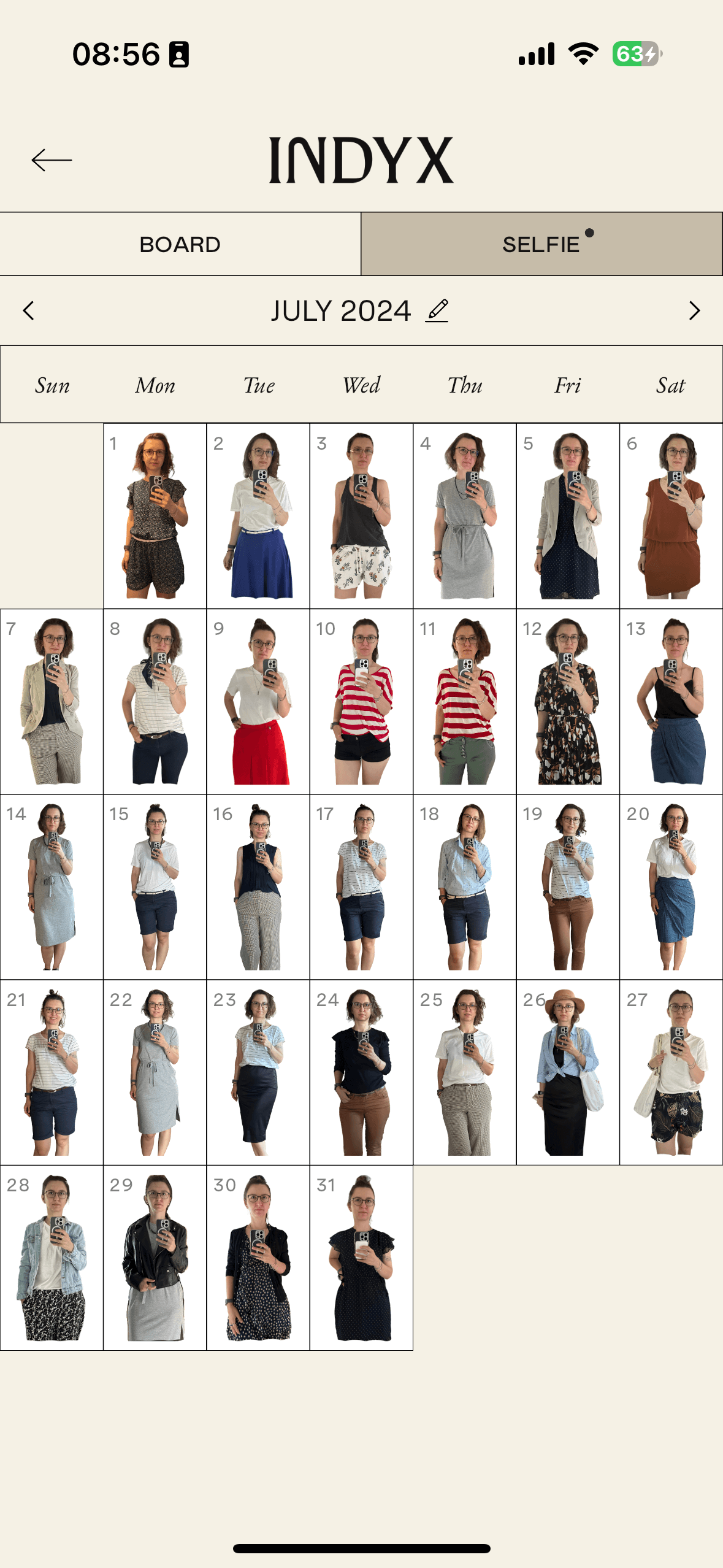
In short, Indyx is a wardrobe and outfit management app. With its features, users can move their real-life wardrobe into the digital world, plan outfits, schedule when to wear them, track usage analytics, and even get advice from professional stylists.
The Team
As I mentioned earlier, the project is created by a team of four: Yidi, Devon, Therese, and Dima. Of these four, only Dima is a developer in the traditional sense. Let me tell you more about each of them:
- Yidi - She is the product manager and UX designer. Her role is to plan the product roadmap and work closely with Dima.
- Devon - Focuses on business development and marketing. She learns from customers and brings new users into the Indyx community.
- Therese - Plays a major role in creating social content and shaping the overall look of Indyx across the app, website, and all brand-related materials.
- Dima - Is responsible for bringing the product vision to life through development.
When the team has only four people, and only one is an engineer, we can say that coding is only 25% of the total work. Over 75% of the effort is not directly related to tech - it involves business decisions, customer and investor relations, budget management, and so on. We often think that we, as developers, we are the most important part of the product development process. Of course, without us, the product would remain just a vision. But as you can see, without the other parts, the entire process would fail. You don’t need a product that no one wants to buy. You don’t have a job if there’s no product to build. And so on.
Update
If you look at Indyx’s LinkedIn page, you may notice that more team members are listed. However, the information about the core team of four people comes from an AMA with Indyx founders, where they shared insights into the early team structure.
Service Design
Since service design aims to improve interactions between service providers and users, and this is exactly what I observe in the development process of the Indyx app, I’d like to first briefly introduce the principles of service design and then discuss how Indyx applies them in practice.
Principles of Service Design
Human-centered - Service designers must consider everyone affected by the service, not just the users. In the case of Indyx, this includes not only app users but also people like professional stylists.
Collaborative - Effective services rely on collaboration between different stakeholders, experts, and users to maximize value. With Indyx, you can see how the team divides responsibilities and how they work closely with users to improve the app experience.
Iterative - Service design is an ongoing process that involves testing, learning, and refining the service continuously. For Indyx, an example of this iterative approach is their commitment to Beta Testing, where they gather valuable user feedback to improve the app.
Sequential - The service experience should be composed of a series of interconnected touchpoints, that create a smooth and enjoyable user journey. For example, in Indyx, users can first add new items and then create outfits to add to their calendar, or they can take the reverse approach by starting with the calendar and building an outfit from there.
Real - Service design must be grounded in the real world, addressing users’ actual needs. In the case of Indyx, every feature request from users reflects these practical needs. The challenge is to prioritize the most impactful features to include in the app, ensuring that development is focuses on what users find most valuable.
Holistic - Services should be designed with a comprehensive approach that considers all aspects of the user experience to ensure an integrated and cohesive service. In the case of Indyx, users can track and plan their outfits, make wardrobe adjustments, and even organize clothes and outfits specifically for travel, creating a seamless experience across all wardrobe management needs.
Key Actions in Service Design
Research - Understanding the people around the service is essential. Research provides data that gives the team insight into the user’s perspective - what they need, what they want to achieve, and why.
Ideation - Systematic generation, management, and improvement of ideas are crucial steps in service design.
Prototyping - Prototypes help identify important aspects of solutions that can be tested and validated in real-world scenarios.
Implementation - After testing, the next step is to move into product development, putting the service into users hands.
The Indyx Way
The Idea
Everything started even before the application became the main focus. At the time:
Yidi was tired of watching brands aimlessly overproduce. Devon was tired of selling clothes that nobody really needed.
In the AMA with Indyx founders, it’s shared that over five years ago, Devon cataloged her entire wardrobe and began tracking everything she wore. This personal experience made her the first user who recognized the app’s potential value. Her early adoption of the system allowed her to naturally empathize with and understand the challenges that other potential users might face, and shaped her vision for Indyx.
Vision & Values
The vision behind Indyx is to break the cycle of overwhelm and overconsumption when it comes to our closets, giving users back control over their wardrobes and clarity about what to wear and why.
We don’t need more clothes, we need more intentional wardrobes, and Indyx is here to help empower you to find yours.
It should feel like a fun fashion playground for endless self-discovery. Indyx believe personal styling is empowering and should be universally accessible.
I know “empowerment” is a term we see in almost every app these days. But let’s put the buzzword aside for a moment. They talk about intentional wardrobes and breaking the cycle of overconsumption. Isn’t that something we want to see more of in the fashion industry today? I think so. The sustainable fashion market has become mainstream, and consumers are increasingly aware of its importance. Even at this level (the vision level), it’s crucial to support initiatives that promote conscious purchasing and making the most of what we already have.
Splitting Work in the Team
Over two and a half years ago, Yidi and Devon began building the styling platform that would become Indyx.
Yidi focuses on what to develop. She collaborates with the team to decide which features to prioritize, then uses Figma to mock up every screen. After discussing the designs with the team, she hands them over to Dima. Yidi is also the first to hear about any bugs in the app, engaging directly with users to understand exactly what went wrong.
Devon, on the other hand, is more customer-focused . She is responsible for bringing users and the right stylists into the Indyx community. She works to understand who they are, what motivates them, why they use Indyx, and how Indyx can better serve them. Her communication with users happens not only directly but also through the blog, social media, and newsletters.
The Process of Selecting Features
Foundation - The core of Indyx is creating a digital record of the user’s wardrobe. Since this process can be time-consuming, the app needs to deliver value to the user as quickly as possible. According to Indyx’s research, about 70% of people in the US are buying secondhand products today, but only 20-30% are selling. While a selling feature is on Indyx’s roadmap, it’s not a priority right now. The focus is on styling what users already own, whether through self-styling or professional styling.
Uniqueness - When deciding which features to add, the team considers which ones are truly new and can’t be easily achieved with other tools. For example, creating mood boards can be done using platforms like Pinterest, but analytics about your wardrobe are harder to find elsewhere. As a result, features like wardrobe analytics are prioritized. You can learn more about how the Indyx team thinks about their product here.
Storage Considerations - A wardrobe app like Indyx needs a lot of storage to handle all the images of clothes, outfits, and selfies. It also processes pictures to remove backgrounds and it needs to do this quickly and in high resolution. This brings substantial costs. Being mindful of storage needs is crucial, as each feature that increases the amount of image data must be carefully considered. Such features may be lower in priority to manage costs effectively.
Regarding to the storage in my example. I currently have about 230 items cataloged and 380 outfits created in Indyx. Let’s say I add a selfie every day of the year, that’s another 365 images. Each image is around 6 MB, so I would upload about 6 GB of data in the first year: (230 + 380 + 365) * 6 = 5850 MB. Even with the Indyx processing and resizing the images, the app still takes up about 2 GB on my iPhone. With 1,000 users, the data needs would easily reach terabytes, underscoring the significant storage and processing demands on the platform’s infrastructure.
User-First Approach
This approach focuses on building the app around a free digital wardrobe while offering user-supported premium features. The user and their satisfaction are key to generating long-term profit for the product. So, how was this achieved?
- Providing Additional Help for Users to Upload Their Clothes:
- Users can order a digitizing service from the Indyx team.
- Alternatively, they can upload items themselves with tips and tricks available on the Indyx Blog on how to do it efficiently.
- Educating Users on Features Like Cost Per Wear, Tag Search, and Wardrobe Analytics:
- This motivates users to invest extra time in adding more detailed information such as price, type, season, color, size, and purchase date. The more data users input, the more valuable insights the app can generate for them.
- Improving Outfit Preparation:
- Indyx offers free style workshops and style quizzes to educate and engage users. This not only helps them learn more about styling but also increases their interaction with the app.
- Creating Tutorials to Avoid Common Questions:
- By consolidating common questions into resources like FAQs on Digital Styling, the team doesn’t have to address the same questions over and over again. The Indyx Blog is an excellent example of this, along with video tutorials for new features.
- Making It Fun and Easy:
- Guides like how to take a better selfie or how to use inspiration boards can shift users’ perceptions of the app and make it feel like a creative and fun tool.
- Building a Community:
- Indyx has a Slack community where users share outfits, tips, and tricks, and can ask for help. Additionally, users can choose to make their closets visible to others, fostering interaction and connection. For example, you can view my closet here.
- Involving Users in the Development Process:
- Users are regularly asked for their input via Slack questionnaires or Google forms, and some are invited to join the beta testing program.
- Transparency:
- Indyx is open about decisions like why they are introducing a paid version.
We never want to have you feel like your wardrobe is being held hostage. We believe at our core the basic functionalities: digitazing wardrobe, creating and saving outfits and tracking what you ware should be free.
Engaging People Even More - The Slack Community
Let’s dive deeper into this topic, as I believe Indyx has done a remarkable job with their Slack community. As I mentioned earlier, after installing the app, users can begin engaging with a short style quiz followed by workshops. Afterward, they can join the Slack channel.
I’ve been part of various Slack and Discord workspaces, and in most cases, they’re chaotic and hard to navigate. But that’s not the case with Indyx. Everything is organized into intuitive categories, making it easy to know where to start, where to introduce yourself, and where to ask questions.
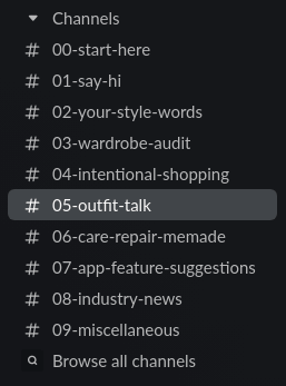
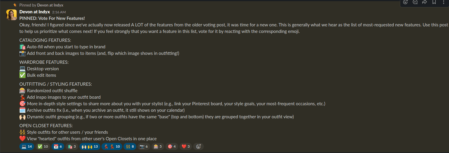
With the growing Slack community, I never feel alone-there’s always someone kind and willing to support me on my styling journey. Slack is the go-to place for announcements, quick feedback, and user interactions. One of the best ways Indyx encourages engagement is by letting users vote on the next major features to add to the app. This level of involvement makes me feel truly included as part of the team.
While this type of involvement might be reserved for early adopters, it’s crucial to create that sense of belonging. Another excellent way to engage users is by inviting them to participate in beta testing.
Beta Testing
After joining the Slack channel, I had the opportunity to participate in the beta testing process. During my time as a beta tester, we explored several new features, including:
- Calendar Feature - the ability to assign outfits to specific days
- Selfie Feature - the option to assign a selfie to a specific date and outfit
- Reorganizing Items - customization of how clothes and outfits are ordered in the overview
- Analytics - detailed information about your wardrobe, including the number of items, total spending, most worn items and outfits, spending trends over time, and more
- Payment Feature - integration with Apple Pay
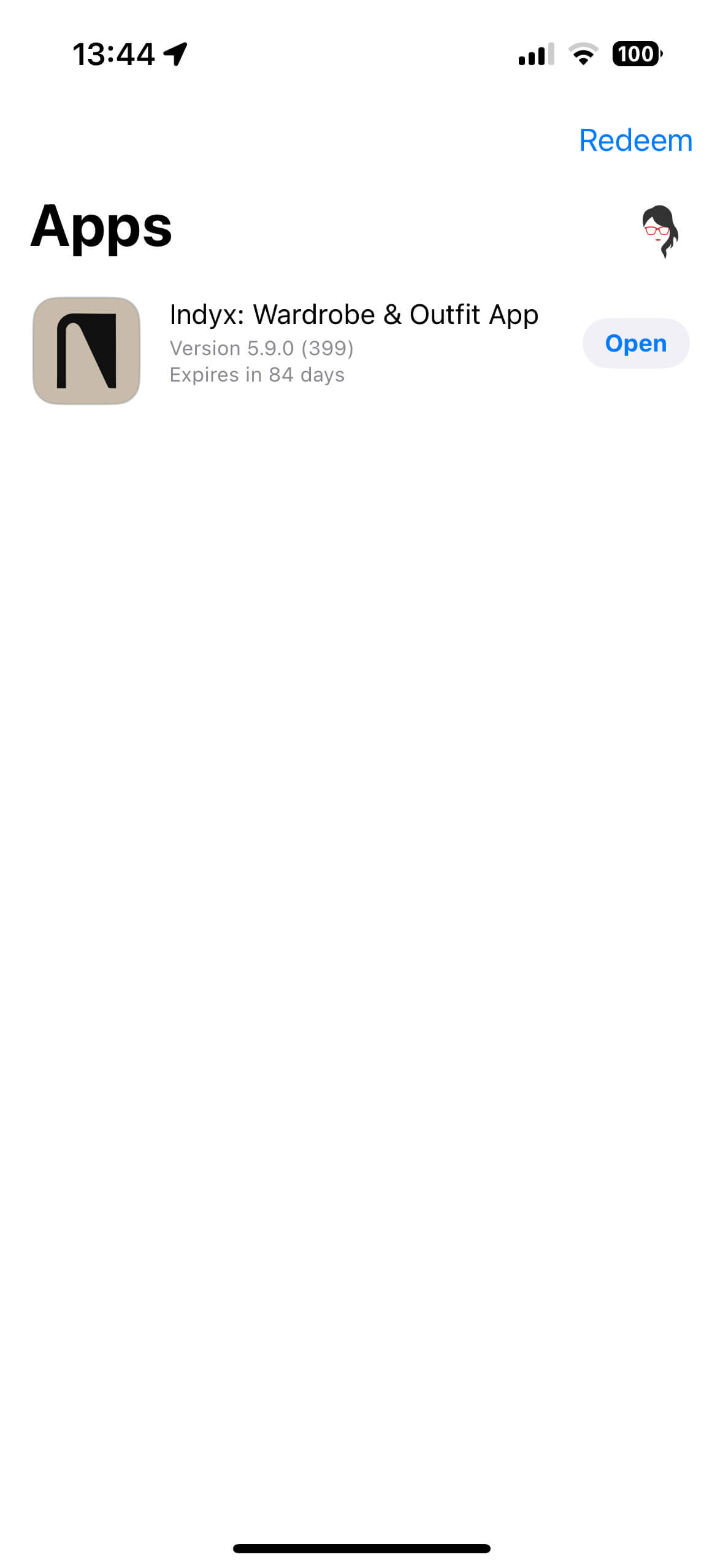
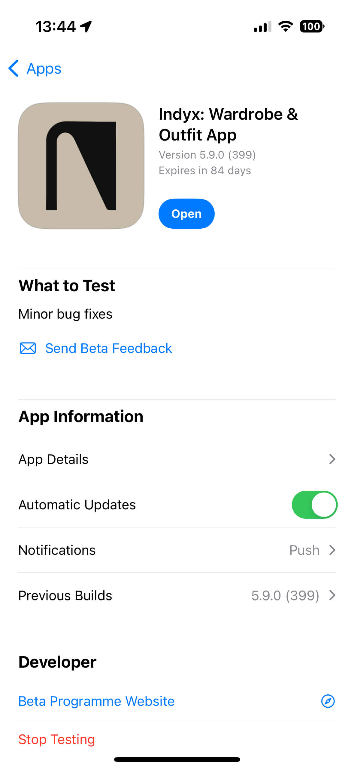
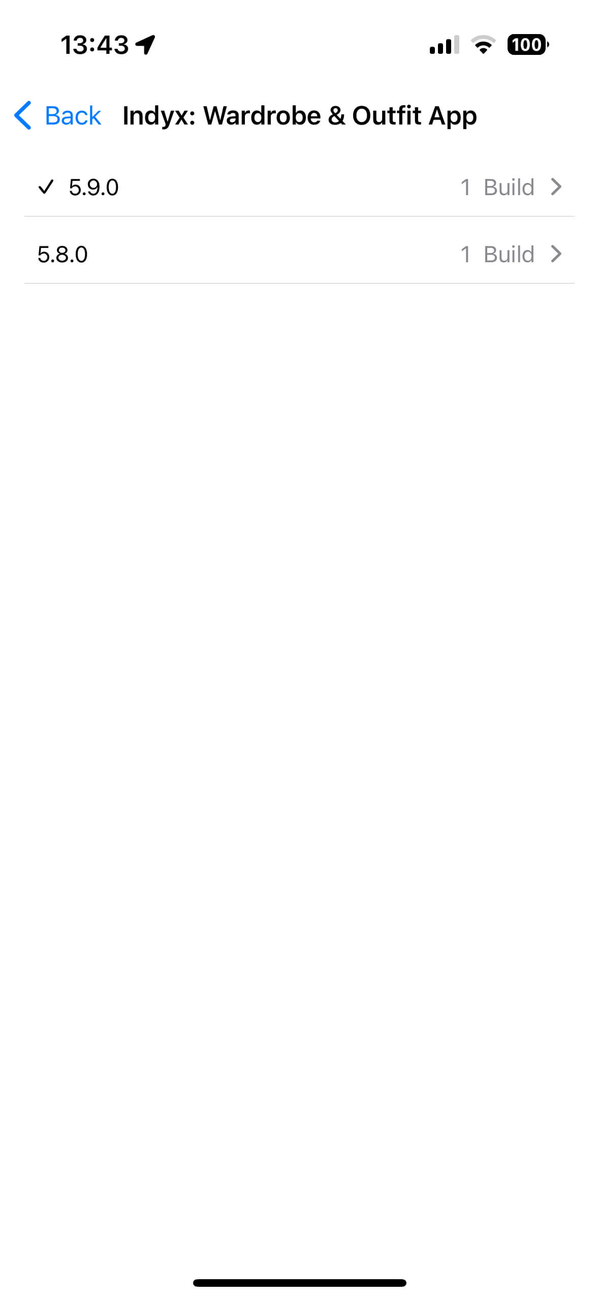
For me, this was a great experience. As an iPhone user, I installed the TestFlight app, which allowed me to access the Indyx app’s different builds. Once installed, I could easily switch between the available test builds and choose which one to explore. On the iPhone, the app in test mode is indicated by a yellow dot next to its name, making it clear that I was working in a test environment. And just like that, I was able to dive in and start testing the app.
Bug reporting
The Indyx app integrates Instabug for seamless bug tracking. To report a bug, simply take a screenshot or shake your phone to activate the reporting feature. From there, you can submit a bug report, ask questions, or share suggestions directly with the Indyx team.
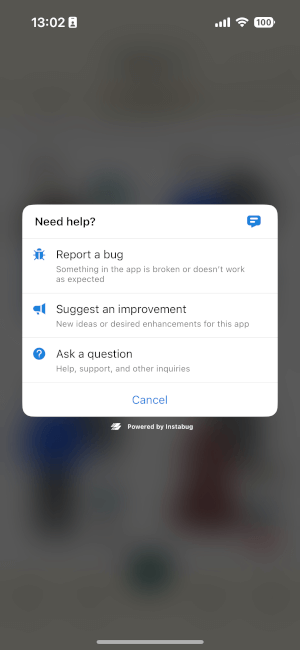
Alternatively, users can use a dedicated Slack channel for bug reporting and feature suggestions. For Android beta testers, Instabug provides a helpful guide to Android App Beta Distribution Tools, which can simplify participation in the testing process.
My findings after testing
Throughout my beta testing, I didn’t encounter any major bugs, which speaks well of the app’s stability. However, I did notice a few UX challenges and have some concerns about data loading and offline functionality.
The app allows for partial use without an internet connection, which is helpful for viewing items, outfits, and the calendar. However, when users attempt actions such as adding items to the calendar or creating a new outfit offline, there’s no warning indicating the need for an internet connection. This can be confusing, as users may assume something is broken rather than unavailable due to connectivity.
Another aspect to consider is the approach to loading data. Currently, it appears all data is loaded upfront, which can increase loading time and bring in more data than a user may need immediately. An alternative could be a “lazy loading” approach, where only the essentials are loaded at the beginning, and additional data is loaded as users access different features. Deciding between these approaches-loading everything initially or using lazy loading-requires weighing the pros and cons to determine which delivers a smoother, more responsive experience. For instance, while initial loading may take longer, it can be offset by smoother transitions, whereas lazy loading offers a faster start-up, but could introduce slight delays when accessing new sections.
Knowing Your Customers - Surveys
After using the app for a while, I was invited to participate in a survey about the app and my needs as a customer. The questionnaire asked several insightful questions about what I wanted to achieve with the app, what was most important to me, and who I was as a user. This allows the Indyx team to better understand their customers and prioritize the features that matter most to them.
Fast Application Development
I’ve been working in web development for over 10 years, and I’ve seen a lot: teams where there wasn’t enough work for everyone, and teams where there was too much work for the capacity. I’ve worked with single-developer teams and with larger ones. So, when I first saw the Indyx app and noticed how quickly new features were being added, I assumed that there had to be at least 3-4 developers involved. But in reality, there’s only one engineer. How is it possible to deliver meaningful features with only one person on the tech side?
- Don’t reinvent the wheel - Use existing tools and integrate them into your app instead of building everything from scratch. For example, Indyx uses Instabug for bug tracking and PhotoRoom for background removal in images.
- Focus on what’s important - A solid roadmap based on customer expectations helps you prioritize. For instance, while only 20-30% of users sell products, most requested a feature to add outfits to the calendar. So, the team focused on that instead of prioritizing the selling functionality.
- Short feedback loop - Fast and easy communication with users regarding bugs, new features, or UI adjustments provides immediate insights into what’s working. Indyx uses tools like Instabug and Slack to maintain a quick feedback loop.
- Add functionality step by step with a larger vision - It’s better to break down functionality into smaller steps but plan ahead. For example, in Indyx, the app originally collected a lot of data about each item, which didn’t provide immediate value. However, this data was later used to enhance search capabilities and provide wardrobe analytics.
- Be your first customer - If you have a need or problem to solve and see others facing the same issue, it’s a good starting point for a great product. By using the app themselves, Yidi and Devon not only act as the first testers of new features, but also stay closely connected to their users’ experience.
Summary
As the Indyx example shows, releasing a successful app involves much more than coding. We haven’t even touched on key areas like marketing, investor relations, talent selection, or financial management-all crucial parts of the process. There’s so much going on beyond the code itself. Thinking like a product manager, or even an end user, can have a profound impact on the development process. Understanding the business, the product, and the domain is essential. To excel, it’s important to look beyond the technical aspects and see the bigger picture. Remember, tech development is just one part of the broader product journey.
From my perspective, working with Indyx has taught me humility both as a user and as a programmer. Here are some key takeaways from my experience using and testing the app over the past few months:
- Having a built-in bug reporting system is a game changer. It’s easy for users to report issues and invaluable for developers.
- Focusing on delivering value to users and building a supportive community gave me a lot of motivation to prioritize meaningful features.
- Seeing how Indyx handles massive amounts of image data, processing, and cloud infrastructure has been fascinating.
- Engaging with people, bringing stylists to the platform, staying true to values, and keeping an eye on the big picture has been truly inspiring.
- Taking care of users throughout the entire process - from uploading photos to styling and analyzing their wardrobes - sets a great example.
- I also learned a lot from how Indyx thinks about monetization and how they want to achieve it within the app.
I’ve gained a lot from this experience, and it has definitely left a lasting impact on how I approach my work.
Referral Code
This article is not sponsored, but if you like the application and the value it provides to its users, you can use my referral code WomanOnRails to get a $10 credit in the Indyx app.
Resources
- AMA with Indyx founders
- Indyx website
- Start with why - how great leaders inspire action - Simon Sinek - TEDx
- This Is Service Design Doing - book
- How I Built This - Podcast about building successful applications
- Principles of Service Design
- #TiSDD Method Library
- Service design - wiki
- Indyx LinkedIn
Need help?
If you're looking for a Ruby developer with over a decade of experience, don't hesitate to contact me.
I have experience in a variety of domains, with a focus on short user feedback loops and teamwork. I can help you build a great product.
Woman on Rails Newsletter
Join a community of like-minded readers and receive my short, insightful emails on self-development, software development, productivity, and team management. Plus, from time to time, I'll share personal insights and stories from the IT world.
